Introduction
This is the fifth article in the “Flutter for Beginners” series, where we are looking at how to get started on developing awesome mobile applications at ease using Flutter. So far we have seen how to set up the environment and looked at various basics of app development such as project structure, widgets, classes and different classes of UI widgets we use for building our applications. By the end of this series, we shall develop a simple blog application with a home list of blog articles with an individual view page.
Read How to setup Flutter Development Environment Here – How to Install and Configure Flutter
Know how a Flutter Project looks like Here – Understanding App Structure and Anatomy
Know What is the purpose of main.dart file Here – main.dart and First run
Know What are Stateless and Stateful widgets Here – Understanding Stateful and Stateless Widgets
In this article, let’s go ahead and build an article page for our blog application. I would like to have three components in my article page; a header section to show a banner image, a title section to show a heading and a content section with long content.
We have already seen in Flutter that everything is a Widget in making; hence we shall define three Widgets for these three areas.
Getting Started
First, let’s build our banner image section which consists of an Image be loaded from the Internet. For this, we use the library class Image, which contains various helpers to render the image. Of these helper methods, let’s choose the one which takes a URL as a parameter and returns an Image: Image.network() method.
The widget can look like below:
class BannerImageWidget extends StatelessWidget {
  @override
  Widget build(BuildContext context) {
    // TODO: implement build
    return Container(
        child: Image.network(
            "https://referbruv.com/wp-content/uploads/2022/05/bitmap.png"));
  }
}
Next, let’s develop the Title widget, which contains a Text with a bigger font and bold content. For this, we’ll use a Text() widget along with added TextFont properties to it. The code can look like below:
class TitleWidget extends StatelessWidget {
  @override
  Widget build(BuildContext context) {
    // TODO: implement build
    return Container(
        child: Text(
      "Flutter for Beginners - Setting up the Card Layout",
      style: TextStyle(fontSize: 24.0, fontWeight: FontWeight.bold),
    ));
  }
}
Third, let’s complete the Content widget, which contains a long text of the entire article content. This shall also be a Text() widget along with added TextFont properties to it, to give it a little smaller font when compared to the Title text. We also add a little Margin on all sides to give a little separation from the widgets above. The widget looks like below:
class DescriptionWidget extends StatelessWidget {
  @override
  Widget build(BuildContext context) {
    // TODO: implement build
    return Container(
        margin: EdgeInsets.all(5.0),
        child: Text(
            "This is the fourth article in the 'Flutter for Beginners' series. So far we have seen what flutter is about and how to get started in the world of flutter. We have also seen the things to be done to setup the flutter development environment and the flutter command line using which we can created a no of articles on how to do the flutter thing. but nothing has been so explanatory as does a thing for all what is required and not required. This is what a scrolling does to do the effect on the parent.",
            style: TextStyle(fontSize: 22.0, wordSpacing: 1.5)));
  }
}
Finally, let’s group all the Widgets together into a Column layout, which shall arrange all these in order of their appearances in a vertical fashion. All this goes under the Scaffolding widget which provides a basic AppBar-ContentView template to make things easy for us. The code looks like below:
class Article extends StatelessWidget {
  @override
  Widget build(BuildContext context) {
    // TODO: implement build
    return Scaffold(
      appBar: AppBar(
        title: Text("Article Home"),
      ),
      body: Column(
        children: <Widget>[
          BannerImageWidget(),
          TitleWidget(),
          DescriptionWidget(),
        ],
      ),
    );
  }
}
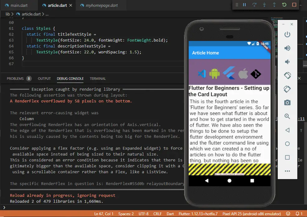
And when you run this setup and expect you’d have a fluid layout of banner, title and content in place. You see the screen looks like this:

And you can find an error in the Debug window which says:
----- Exception caught by rendering library -----

The following assertion was thrown during layout:

A RenderFlex overflowed by 58 pixels on the bottom.

The relevant error-causing widget was
 Column
The overflowing RenderFlex has an orientation of Axis.vertical.
The edge of the RenderFlex that is overflowing has been marked in the rendering with a yellow and black striped pattern. This is usually caused by the contents being too big for the RenderFlex.

Consider applying a flex factor (e.g. using an Expanded widget) to force the children of the RenderFlex to fit within the available space instead of being sized to their natural size.
This is considered an error condition because it indicates that there is content that cannot be seen. If the content is legitimately bigger than the available space, consider clipping it with a ClipRect widget before putting it in the flex, or using a scrollable container rather than a Flex, like a ListView.

The specific RenderFlex in question is: RenderFlex#55d0b relayoutBoundary=up1 OVERFLOWING
Which simply means that the content has overflown the actual height of the mobile screen. Since the content we try to render in the Content widget goes beyond the total vertical viewport of the screen, Flutter fails to render it and instead throws an exception.
The same is reflected over the app screen with a yellow tint of the overflown text. Now how do we solve this?
One mistake we did while laying things inside the scaffold is that we haven’t describe how the app should behave if there’s excessive widget height being rendered onto the screen. The Column() widget can only hold and lay the widgets in the vertical fashion but it cannot decide on overflowing conditions.
For this we should wrap the column itself under another container (not the Container() widget we’re talking about) which can handle overflow conditions. Enter the SingleChildScrollView() widget.
The SingleChildScrollView() widget wraps overflowing content widgets under a scrollable view along with a scrollbar so as to push the overflown content below and still be able to render all the widgets continuously.
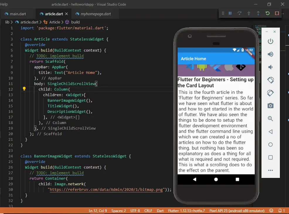
This avoids the excessive height issue and gives the screen the required fluid look. And in our application, we wrap our Column() widget (which itself wraps all the content widgets in the vertical layout fashion) under the SingleChildScrollView() widget which has a child property.
class Article extends StatelessWidget {
  @override
  Widget build(BuildContext context) {
    // TODO: implement build
    return Scaffold(
      appBar: AppBar(
        title: Text("Article Home"),
      ),
      body: SingleChildScrollView(
        child: Column(
          children: <Widget>[
            BannerImageWidget(),
            TitleWidget(),
            DescriptionWidget(),
          ],
        ),
      ),
    );
  }
}
And when we save and do a hot-reload (or F5) on the flutter codebase, we see that the error is now gone and also a part of our content is now missing on the viewport. And when we scroll it down, we see an otherwise invisible scrollbar scrolling things down to the rest of the content. Awesome right?

The SingleChildScrollView() widget has a property “scrollDirection” which defines in which direction the scrollbar shall occur. The values are Axis.vertical, or Axis.hortizontal which gives out a X-axis scrollbar or a Y-axis scrollbar. In our case we don’t provide any direction in specific and hence the scrollbar defaults to the vertical or Y-axis direction, which is also its default direction.
In this way we can create a fluid app screen with a series of widgets without having to get into overflow issues using the ScrollView().


very helpful, thanks.