This is the seventh article in the “Flutter for Beginners” series in which we have been looking at getting started with app development using Flutter framework. So far we have seen how to setup environment for our development and then inspected all the files and folders that come with the boilerplate code when we create a new flutter project along with the steps to run the application.
Then we looked at how to develop a single scrollable view and then have been inspecting various Widgets that are used underneath. In this article let’s talk about yet another widget duo which are used to hold a series of Widgets with a sense of direction of their presentation. Let’s talk about the row and column widget.
In Order
Article 1 – Setting Things up and Getting Started
Article 2 – Understanding App Structure and Anatomy
Article 3 – Understanding the main.dart and flow of execution – First run
Article 4 – Understanding Stateful and Stateless Widgets
Article 5 – Creating a Scrollable Content View
Article 6 – Understanding a Scaffold Widget
Row and Column – How they Work?
A Row is a horizontal entity and a Column is a vertical entity, in a Grid system. When we talk about a “Grid” system, we are talking in lines of the Grid systems we use in a typical web application framework such as Bootstrap or Flex or any others.
A Grid is a combination of several rows and columns which define the sense of direction in which the respective components within the Grid are laid out in the view. A Column travels along the Y-axis direction from top to bottom, whereas a Row travels along the X-axis direction from left to right.
And when we arrange a group of View items within a Row, we are rendering them on the X-axis from left to right horizontally, whereas when we arrange a group of View items within a Column, its laid out vertically from top to bottom along the Y-axis. Now why we are talking in terms of X and Y axes all of a sudden? We’ll get to that in a bit.
In Flutter, where we talk only in terms of Widgets, we do have Row and Column widgets, which help in rendering their child Widgets in the axis of their orientation respectively (X axis for Row and Y axis for Column).
A Row or a Column Widget has a property Children: which accepts an array of Widget items for rendering. For example, in our previous example of showing up an Article page with an Image, Title and Description; we have subconsciously used a “Column” in order to lay these Widgets in order “Vertically”.
Let’s take another example where we want to show a series of boxes each with a specific color (for representation). Let’s say we have created a sample View as below:
class ColorBox extends StatelessWidget {
  String boxText;
  Color color;

  ColorBox(this.boxText, this.color);

  @override
  Widget build(BuildContext context) {
    return Container(
      constraints: BoxConstraints.tightFor(height: 125.0, width: 100.0),
      // height: 20
      decoration: BoxDecoration(color: color),
      child: Text(boxText),
    );
  }
}
The “div” like Container
The Container Widget holds on a single Child Widget with extended attributes such as Margin, Padding, Border, BackgroundColor and such. We can simply assume a Container() Widget is equivalent to a <div> tag in html.
Now within a Container() we have a single child Widget Text() which does nothing but display a passed text string via constructor. And the BoxDecoration() provides various attributes to decorate the Container() as a whole such as a backgroundColor in this case.
I’m passing the Color to be painted as well via the constructor. And then we have the BoxConstraints.tightFor() with a passed parameter of height. This makes sure that the box painted is fixed off its height at 125 dp and width at 100 dp.
Coming to the ColorBoxesRow() Widget, it forms a row of horizontally placed ColorBox() with a rowCount parameter, which denote the cell index. And then we create three ColorBox() widgets with the parameters of text containing the cell index and a color for them to be shown inside the Widget.
class ColorBoxesRow extends StatelessWidget {

  int rowCount;

  ColorBoxesRow(this.rowCount);

  @override
  Widget build(BuildContext context) {
    // TODO: implement build
    return Row(
      crossAxisAlignment: CrossAxisAlignment.start,
      mainAxisAlignment: MainAxisAlignment.spaceAround,
      children: <Widget>[
        ColorBox("This is Blue Box $rowCount 1", Colors.blue),
        ColorBox("This is Green Box $rowCount 2", Colors.green),
        ColorBox("This is Red Box $rowCount 3", Colors.red),
      ],
    );
  }
}
When we run this setup we get the below view.
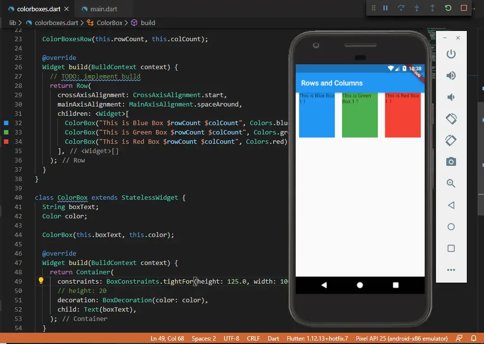
crossAxisAlignment vs mainAxisAlignment
Within a Row() we have defined a crossAxisAlignment and a mainAxisAlignment. This is where our comparison with the X and Y axes from above comes into picture. As we can see, the ColorBoxes are painted horizontally across the X-axis from left to right.
And when we say mainAxisAlignment for a Row, it’ll be X-axis. And crossAxisAlignment shall be its counterpart, aka the Y-axis. Which means that the mainAxisAlignment property defines how the elements are rendered along its own axis, while the crossAxisAlignment shall define how the elements are aligned across the other axis.
Now we have set the MainAxisAlignment to be spaceAround, which means that the child elements shall be rendered with “free space evenly between the children as well as half of that space before and after the first and last child.” And so there is this even spacing along the elements. We do have other options such as start, end, center, spaceBetween and spaceEvenly.
And for the crossAxisAlignment we set it to start, which means that the elements are aligned at the start of their counter axis. And so the elements are sticked to the top of the screen (remember this is a Row and its counter axis is Y which starts from the top to the bottom).
Other values for CrossAxisAlignment are start, center, stretch, end and baseline.
Now let’s add more such rows across a column so as to set up a Grid of color boxes.
class ColorBoxesColumn extends StatelessWidget {
  @override
  Widget build(BuildContext context) {
    return Column(
      crossAxisAlignment: CrossAxisAlignment.stretch,
      mainAxisAlignment: MainAxisAlignment.spaceEvenly,
      children: <Widget>[
        ColorBoxesRow(1),
        ColorBoxesRow(2),
        ColorBoxesRow(3),
      ],
    );
  }
}
In this case, it is a Column() widget that holds three elements of ColorBoxesRow() with a row index passed in each element. The crossAxisAlignment is set to stretch, which means to occupy maximum space across the counter axis (which is X-axis in this case) and the mainAxisAlignment is set to spaceEvenly across the Y-axis (since this is a Column which runs from top to bottom).
And when we run this setup, we finally get the output we have been expecting. i.e. a Grid!
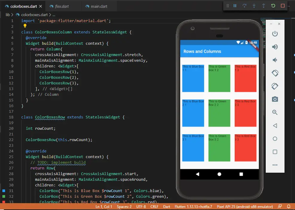
In this way, we can create a Grid of Rows and Columns of elements using the conventional Row and Column widgets. And emphasise a Widget a bit extra using a Container widget.

Found this article helpful? Please consider supporting!